
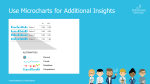
 As we already know, it is very advantageous to rely on information density. Micro charts are another instrument for this. The small diagrams are placed in a table or in a KPI tile and provide visual support for the information shown. The chart is chosen depending on the message to be conveyed (see Reporting Rule 8). By clicking into further levels, more detailed information can be displayed, and a deeper analysis of the data can be performed. Of course, micro charts should also be used uniformly.
This rule and others are explained in detail in the reportingimpulse Academy. Get Insights our Visual Data Analytics Beginner’s Package here! In addition to our most important rules for dashboarding, it includes learning videos on the corresponding topic, book recommendations, reportingimpulse SharePics and much more.

The poster with all Information Design and Dashboarding rules :


 Wie wir mittlerweile wissen, ist es sehr vorteilhaft auf Informationsdichte zu setzen. Ein weiteres Instrument dafür sind Microcharts. Die kleinen Diagramme werden in eine Tabelle oder in eine KPI-Kachel platziert und bieten eine visuelle Unterstützung zu den gezeigten Informationen. Die Wahl des Diagramms ist abhängig von der Botschaft, die vermittelt werden soll (siehe
