

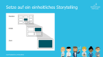
 The quality of your dashboard depends on how well thought-out your storytelling is. However, the basic structure is always the same: from the overview on a landing page, you can access the detailed level(s) via filters or drill downs and finally the zoom level(s). Your storytelling concept should be based on the tasks, questions and experiences of your user group. These three aspects can be used to categorize users, as the contents of the individual groups also differ. For example, a manager needs fewer details and interactions than a data scientist who needs a lot of information to perform a thorough analysis.
This rule and others are explained in detail in the reportingimpulse Academy. Get Insights in our Visual Data Analytics Beginner’s Package here! In addition to our most important rules for dashboarding, it includes learning videos on the corresponding topic, book recommendations, reportingimpulse SharePics and much more.

The poster with all Information Design and Dashboarding rules:
 Wie gut Ihr Dashboard wird, ist abhängig davon, wie durchdacht Ihr Storytelling ist. Der grundlegende Aufbau ist jedoch immer gleich: Von der Übersicht auf einer Landingpage, kommt man über Filter oder Drill downs in die Detailebene(n) und zuletzt in die Zoomebene(n). Ihr Storytelling Konzept sollte auf den Aufgaben, Fragen und Erfahrungen Ihrer Nutzergruppe basieren. Anhand dieser drei Aspekte können Nutzer kategorisiert werden, denn auch die Inhalte der einzelnen Gruppen unterscheiden sich. So braucht ein Manager zum Beispiel weniger Details und Interaktionen als ein Data Scientist, der die Bereitstellung vieler Informationen benötigt um eine tiefgreifende Analyse durchzuführen.
 When you click through a dashboard and analyze the data, you’re reflecting on thoughts that can be very valuable to others. Wouldn’t it be helpful to capture them so the next person can build on them? That’s why commenting is an important functionality and should be actively used. Small reminder: Use the pyramid principle – first the central message, then the arguments. There are freestanding comments, usually on the right margin, and linked comments that refer to a certain value. Notes can also be placed in tables. Instead of highlighting, comments can also be linked to parts of the diagram using different colors. Guide the reader and provide additional information without commenting indiscriminately or excessively.
 Wenn Sie sich durch ein Dashboard durchklicken und die Daten analysieren, machen Sie sich Gedanken, die für andere sehr wertvoll sein können. Wäre es nicht hilfreich, diese festzuhalten damit die nächste Person darauf aufbauen kann? Genau deshalb ist das Kommentieren eine wichtige Funktionalität und sollte aktiv genutzt werden. Kleine Erinnerung: Nutzen Sie dabei das Pyramidenprinzip – erst die zentrale Botschaft, dann die Argumente. Es gibt freistehende Kommentare, meist am rechten Rand, und verknüpfte Kommentare, die auf einen bestimmten Wert verweisen. Auch in Tabellen können Anmerkungen platziert werden. Statt des Highlightings, können Kommentare auch farblich mit Teilen des Diagramms verbunden werden. Führen Sie den Leser und geben Sie Zusatzinformationen, vermeiden Sie dabei wahllos oder ausschweifend zu kommentieren.
 This rule is derived from
 Diese Regel leitet sich von der Dashboard
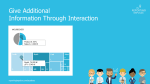
 The integration of interactive activities into the dashboard offers many advantages. For example, a navigation bar helps you keep track of what’s going on as you drill down into deeper levels. It also serves as an intuitive control where you can skip any level. In addition, it helps to create and structure the dashboard, because every page needs a name and every path has to be defined. We recommend simplifying navigation and interaction as much as possible – three filters and three lines in the title concept are usually enough. Even within diagrams, interaction in the form of (combined) highlighting, mouse over or drill in functions provides a higher added value.
 Die Integration von interaktiven Aktivitäten in das Dashboard bietet viele Vorteile. So hilft eine Navigationsleiste den Überblick zu behalten, wenn man sich in tiefere Ebenen reindrillt. Zudem dient sie auch als eine intuitive Steuerung, in der man beliebig Ebenen überspringen kann. Viel mehr hilft sie noch bei der Erstellung und Strukturierung des Dashboards, weil jede Seite einen Namen braucht und jeder Pfad definiert werden muss. Wir empfehlen die Navigation und Interaktion größtmöglich zu vereinfachen – es reichen meist drei Filter und drei Zeilen im Titelkonzept. Auch innerhalb von Diagrammen liefert Interaktion in Form von (kombiniertem) Highlighting, Mouse over oder Drill in Funktionen einen höheren Mehrwert.
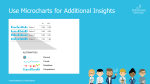
 As we already know, it is very advantageous to rely on information density. Micro charts are another instrument for this. The small diagrams are placed in a table or in a KPI tile and provide visual support for the information shown. The chart is chosen depending on the message to be conveyed (see
 Wie wir mittlerweile wissen, ist es sehr vorteilhaft auf Informationsdichte zu setzen. Ein weiteres Instrument dafür sind Microcharts. Die kleinen Diagramme werden in eine Tabelle oder in eine KPI-Kachel platziert und bieten eine visuelle Unterstützung zu den gezeigten Informationen. Die Wahl des Diagramms ist abhängig von der Botschaft, die vermittelt werden soll (siehe
