Christoph, Viktoria and Kaigive you an overview of the IBM Cognos TM1 and its use at Deutsche Bahn.
Watch the stream to this episode:
Christoph is a senior in-house consultant for business intelligence projects at DB Systel, the IT service provider within the Deutsche Bahn Group. For ten years now, he has been dealing almost exclusively with what is probably the most well-known functional database on the BI market: IBM Cognos TM1 (or more recently Planning Analytics). In addition to this activity, Christoph also works as a lecturer in the field of business intelligence at various universities and occasionally publishes.
Here’s what you can take away from the episode:
What makes a TM1 fanboy
What real love for the tool and the technology means
Why the use of TM1 fits so well at Deutsche Bahn
In which use cases it is used
Why TM1 in combination with Excel as a frontend is so popular in departments
You liked this episode? Then please give us a quickiTunes-review!
Which questions should we ask next? Which interview partners would you like to hear? Please write us an email info@reportingimpulse.com, viaTwitteror get in direct contact with us!
Nick, Viktoria and Kaitalk about practical application, user experience, product character, and the associated change management to achieve sustainable and successful dashboarding initiatives.
Watch the stream to this episode:
Nick leads G&K Consulting, a US-based consulting firm that does business across the globe. He is a regular on the international speaking circuit on the topic of analytics adoption as well as having several online courses available on the topic. Nick is the creator of the Dashboard Wireframe Kit and the Dashboard Requirements Kit, boardgame approaches to driving analytics adoption.
In our podcast with Nick, here’s what you can take away for yourselves:
Insights from data projects around the globe
Key learnings from successful BI initiatives that focus on people and organization
How you can save yourself 20 years of experience with an improved approach
What the Enterprise Dashboard Process is all about
Why not the tool but the methods are crucial
Some C-level experiences from dashboarding projects and why knowing your audience is so important
You liked this episode? Then please give us a quickiTunes-review!
Which questions should we ask next? Which interview partners would you like to hear? Please write us an email info@reportingimpulse.com, viaTwitteror get in direct contact with us!
Anna, Viktoria and Kaitalk about leadership, team development and the success factors to bring Data Science from playground to implementation.
Anna is a Domain Owner of Data Science at Metro.digital – an IT devision of METRO AG – driving the story of data science within the whole Metro business. Previous to this position, being a product owner, Anna guided five recommender systems to their success. This journey included transition to cloud, introduction of agile working principles, and the most important – the step from PoC to live products. Before recommender systems, Anna focused on robotics and smart logistics at Zalando SE. As a product manager, she was responsible for warehouse automation with bagsorter system, which included transition to cloud, third party integration, negotiation and planning of constructional and IT interplay. Anna has a strong empathy for the owned products and their users and believes you have to love what you do!
Here’s what you can take away from the episode:
Why the combination of Data Science and Product Management is so important
Why a data science leader must speak and understand the tech and business language
Play time is over – organizational requirements for companies to really get it on the road
You liked this episode? Then please give us a quickiTunes-review!
Which questions should we ask next? Which interview partners would you like to hear? Please write us an email info@reportingimpulse.com, viaTwitteror get in direct contact with us!
Nicolas, Viktoria and Kaitalk about how data analytics has evolved over the past few years and what Nicolas learned during his time at IKEA and HomeAway.
Nicolas works as Business and Data Analytics Manager in Germany since 2001. 4 years ago, he built the first German eCommerce Data Analytics team at IKEA Germany. After his master in Management and Economics, he built his career at the crossroads between BI and Controlling before he joined in 2012 one of the early US marketplaces (Homeaway.com) where he learned best in classe Data Analytics and discovered Data Science.
Here’s what you can take away from the episode:
Journey from reporting to data analytics – what has changed in recent years?
Importance of data analytics at IKEA.
Differences between analytics for pure online platforms and companies with many operational processes
You liked this episode? Then please give us a quickiTunes-review!
Which questions should we ask next? Which interview partners would you like to hear? Please write us an email info@reportingimpulse.com, viaTwitteror get in direct contact with us!
Jon, Viktoria and Kai talk about Data Viz and its importance, opportunities and feasibility in practice.
Dr. Jonathan Schwabish is founder of the data visualization and presentation skillsfirm, PolicyViz and a Senior Fellow at the Urban Institute, a nonprofit research institution in Washington, DC. There, he is a researcher in the Income and Benefits Policy Center and a member of the Institute’s Communication team where he specializes in data visualization and presentation design. His research agenda includes such areas as earnings and income inequality, immigration, disability insurance, retirement security, data measurement, the Supplemental Nutrition Assistance Program (SNAP), and other aspects of public policy. Jonathan is also considered a leader in the data visualization field and is a leading voice for clarity and accessibility in research. He has written on various aspects of how to best visualize data including technical aspects of creation, design best practices, and how to communicate social science research in more accessible ways. In both positions, Jonathan helps nonprofits, research institutions, and governments at all levels improve how they communicate their work and findings to their partners, constituents and citizens. He also teaches data visualization and presentation skills at Georgetown University, American University, the University at Buffalo, and in public workshops. He also hosts the PolicyViz Podcast, which focuses on data, open data, and data visualization. His book Better Presentations: A Guide for Scholars, Researchers, and Wonks helps people improve the way they prepare, design, and deliver data-rich content and his edited book, Elevated the Debate: A Multilayered Approach to Communicating Your Research, helps people develop a strategic plan to communicating their work across multiple platforms and channels. His latest book, Better Data Visualizations: A Guide for Scholars, Researchers, and Wonks details essential strategies to create more effective data visualizations.
In today’s episode you will learn:
Why the topic of DataViz is and remains so exciting
Insights from Jon’s new book „Better Data Visualizations: A Guide for Scholars, Researchers, and Wonks“.
Is there one best visualization or one that always works?
Is there a favorite tool for a DataViz expert?
More recommendations on other formats and colleagues in the DataViz environment.
You liked this episode? Then please give us a quickiTunes-review!
Which questions should we ask next? Which interview partners would you like to hear? Please write us an email info@reportingimpulse.com, viaTwitteror get in direct contact with us!
Together withRaphael,ViktoriaandKaitalk about how agility comes about in BI projects and what successful requirements management looks like.
As Principal Consultant Data & Analytics atIT-Logix AG,Raphael helps organizations to collect and implement their data and analytics requirements. He is also a strategist, architect, requirements engineer, agile coach but also a developer. In this way, he brings a holistic view into his projects. In addition to his project work, Raphael is heavily involved in community work and shares his knowledge as a speaker, author and moderator locally and globally. As a member of the board of directors and partner, Raphael is also responsible for the strategic direction and development of IT-Logix, in which he has been active since 2002.
From episode you can take out the following for yourselves:
🇨🇭 3 reasons what makes life in Switzerland special 🚀 How can agility and BI successfully grow together? 🏋️♀️ How much agility can a project or organization take? 🦾 What is the ideal dashboard requirement process? 📊 How can IBCS and other standards support it? 🎙 How can I motivate automation in BI projects?
You liked this episode? Then please give us a quickiTunes-review!
Which questions should we ask next? Which interview partners would you like to hear? Please write us an email info@reportingimpulse.com, viaTwitteror get in direct contact with us!
Nicolas,ViktoriaandKaitalk about Digital Finance and Controlling in an international environment and how LinkedIn can be a valuable support and source of information.
„My current professional role: I am currently heading the Finance and Controlling team of one of the Business Line of Thales Germany. MIS is specialised in producing Traveling Waves Tubes for Satellites. My story: I am half French, half Belgian and being raised with 2 different cultures brought me where I am today. I lived in 5 different countries across 3 different continents (France, USA, Luxembourg, Singapore and Germany) and at home or at work, I am constantly switching between speaking English, German and French. My private life: I am married and a happy father of two young daughters. We both learn from each other and we enjoy reading french books together and going outside together. When I am not busy with my daughters, I am working out to stay healthy and feel good (I recently bought a Peloton, hit me up if you are also a Peloton member). Traveling and tasting new food are some of my favorite experiences. But if you ask me where is the most beautiful place and where can we find the best food in the world, I have only one response: my hometown, Brittany in France (check my Linkedin banner to see the beauty of it).“ –Nicolas Boucher, Thales
Here’s what you can take away from today’s podcast:
🚦 Why every finance and controlling department should be looking at automated dashboards 🏁 How to get digital finance on the road? 👍 How you can use LinkedIn to become a better controller? ⚡️ Practical shortcuts to forecasting? 📱 What we should adopt from iPhone apps for our business applications?
You liked this episode? Then please give us a quickiTunes-review!
Which questions should we ask next? Which interview partners would you like to hear? Please write us an email info@reportingimpulse.com, viaTwitteror get in direct contact with us!
Andy,ViktoriaandKaion using the DataViz Design Process in everyday business practice.
Andy Kirkis an experienced UK-based data visualisation design consultant, trainer, lecturer, author, speaker, and researcher. He is the editor of visualisingdata.com and host of the ‘Explore Explain’ video and podcast series. Since foundingVisualising Data Ltd. in 2010, Andy has worked with a wide range of clients, including Apple, S&P Global, Arsenal FC, Google, EU Council, and Pfizer. He has conducted over 300 public and private training courses in 27 different countries. Andy has previously delivered post-graduate teaching with MICA (USA) and Imperial College (UK), and is now an adjunct lecturer at UCL (UK), teaching a module on the MSc Business Analytics programme. He has authored three books, with the most recent published by Sage in August 2019 and titled ‘Visualising Data: A Handbook for Data Driven Design (2nd edition)’.
Here’s what you can take away from the podcast today:
📈 You understand the DataViz Design Process and how to use it
🧐 Projects and companies that have made a lasting impression on Andy
🚀 How each of you, regardless of hierarchy level, can successfully launch a DataViz initiative
⚒️ Why do we need to talk about tools in addition to method?
💪🏼 What makes a good virtual training?
📊 Where can we get inspiration for new DataViz projects?
You liked this episode? Then please give us a quickiTunes-review!
Which questions should we ask next? Which interview partners would you like to hear? Please write us an email info@reportingimpulse.com, viaTwitteror get in direct contact with us!
In dieser Folge heißt es wieder „Frag reportingimpulse“.
Nach vielen Wochen hat Kai endlich wieder 5 Fragen an Andreas mitgebracht.
Es geht um die Top 3-Gründe, warum BI-Projekte scheitern und was es mit dem „lebenslangen Lernen“ auf sich hat. Wir befassen uns mit digitalen Events, diskutieren darüber, wie sich die derzeitige Krise auf das Thema BI auswirkt und Andreas verrät uns, welchen inhaltlichen Fokus er momentan als Leiter BI in einem Unternehmen legen würde. Ob Dashboards als Feed funktionieren entfacht eine hitzige Diskussion, denn bei Scroll-Balken vs. Drill Down sind sich Kai und Andreas überhaupt nicht einig!
Außerdem erfahren wir in dieser Folge, wo und wann BI vor DIE eigentlich gehört wird und wie man mit einer DataViz-Challenge eine Kiste Rotwein gewinnen kann.
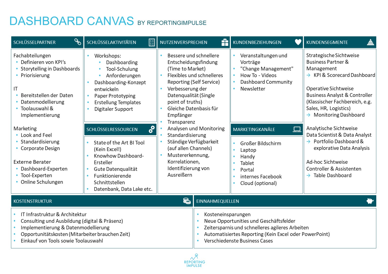
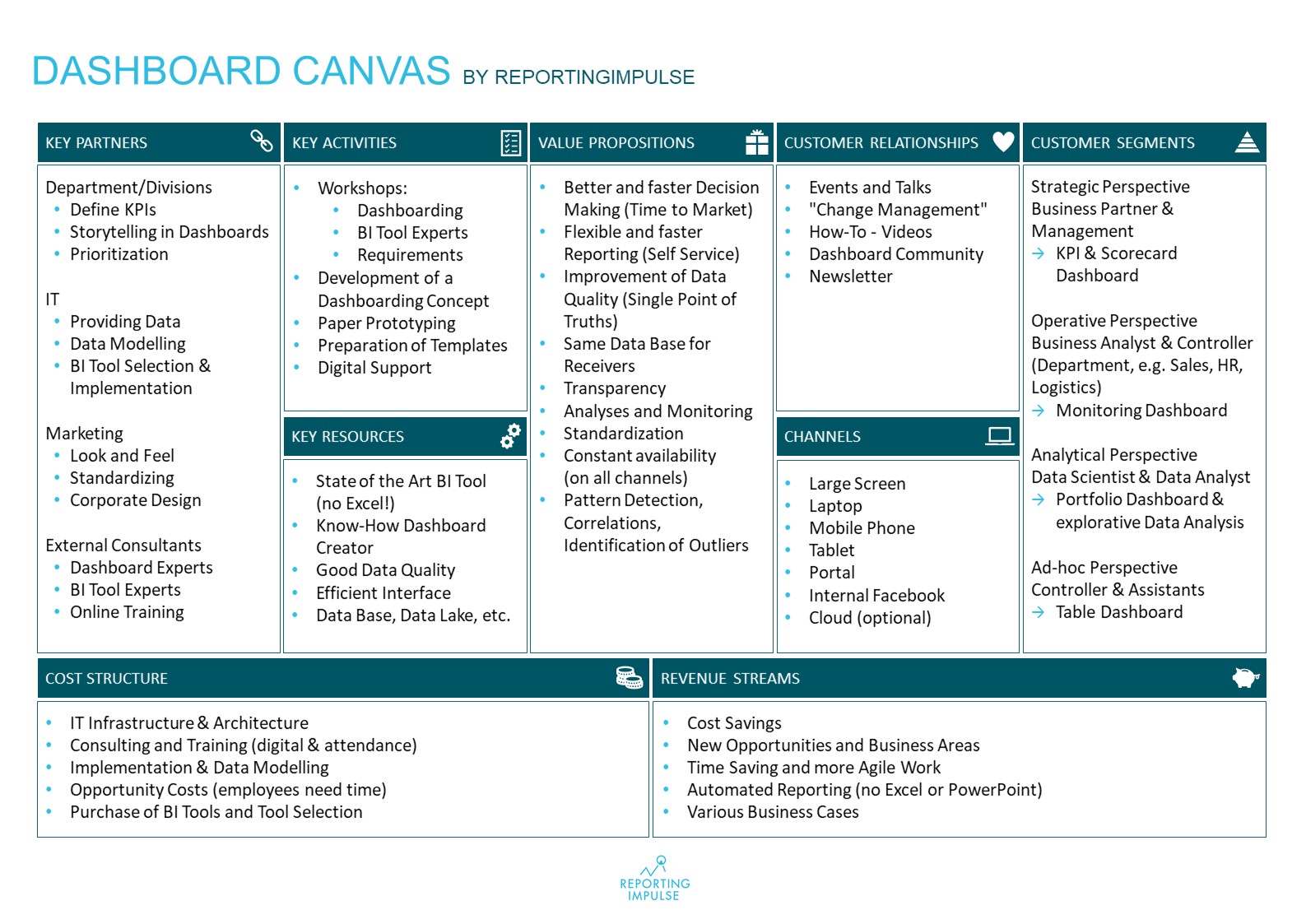
Wir besprechen ausführlich den Aufbau des Dashboard-Canvas-Modells.
In dieser Folge besprechen wir wie angekündigt über das Dashboard-Canvas-Modell. Was ist das überhaupt und aus welchen Teilen besteht es? Wir gehen auf die einzelnen Kategorien genauer ein und überlegen, wie das Modell in Unternehmen bei Dashboard-Projekten unterstützend eingesetzt und benutzt werden kann.
Hier könnt ihr euch das Dashboard-Canvas-Modell nochmal genauer anschauen:
Eine kleine Zusammenfassung. Neugierig? Dann hört mal rein!