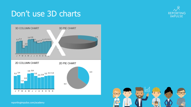
 3D charts are regularly used in companies, but they offer no added value. On the contrary – they distort the data and appear unreliable. According to a joint study with the Fraunhofer Institute, information from a 3D chart is perceived up to seven(!) times worse. So the next time you want to embellish dry data with 3D effects, remember that you don’t decorate your mails to the boss with Word Art either. 😉
This rule and others are explained in detail in the reportingimpulse Academy. Get Insights in our Visual Data Analytics Beginner’s Package here. In addition to our most important rules for dashboarding, it includes learning videos on the corresponding topic, book recommendations, reportingimpulse SharePics and much more.
You will find further information about our online learning platform here.

The poster with all Information Design and Dashboarding rules:
