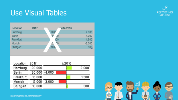
 A clear recommendation and also often used are visual tables. Therefor standardized tables are enriched by graphics. Micro charts are for example used before the description and the choice of the chart type depends on whether you want to see proportions, developments or trends. Within the data, the representation of absolute and/or percentage deviations is very popular. These can also be visually distinguished by thick and thin bars. In this way, outliers can be identified at one glance instead of first having to compare numbers.
This rule and others are explained in detail in the reportingimpulse Academy. Get Insights in our Visual Data Analytics Beginner’s Package here. In addition to our most important rules for dashboarding, it includes learning videos on the corresponding topic, book recommendations, reportingimpulse SharePics and much more.

The poster with all Information Design and Dashboarding rules:

