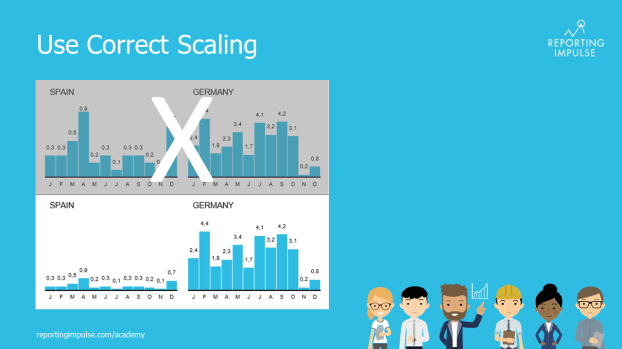
 Scaling is a very important aspect when visualizing data. If you don’t take this into account, you run the risk of distorting the data and leaving a false visual impression on the viewers. As a rule of thump, the axes should always start with 0. Charts that are related should be scaled uniformly and displayed on one page. This provides the best comparability.
This rule and others are explained in detail in the reportingimpulse Academy. Get Insights in our Visual Data Analytics Beginner’s Package here. In addition to our most important rules for dashboarding, it includes learning videos on the corresponding topic, book recommendations, reportingimpulse SharePics and much more.
You will find further information about our online learning platform here.

The poster with all Information Design and Dashboarding rules:
