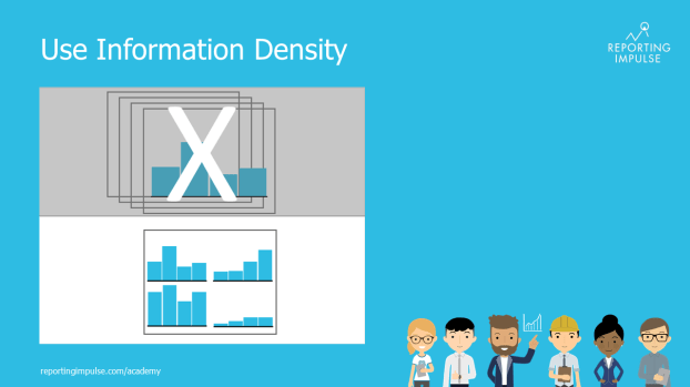
 Do you know the change blindness effect? According to it, we cannot remember all the information in similar consecutive images and do not perceive major changes. This impairs the comparability of charts. But if you increase the density of information on one page, you can compare several charts at once and provide even more information about the data by e.g. implementing microcharts and highlights. And don’t worry – if tourists can manage it with a subway map, your colleagues won’t have any problems with the high information density.
This rule and others are explained in detail in the reportingimpulse Academy. Get Insights in our Visual Data Analytics Beginner’s Package here. In addition to our most important rules for dashboarding, it includes learning videos on the corresponding topic, book recommendations, reportingimpulse SharePics and much more.

The poster with all Information Design and Dashboarding rules:
