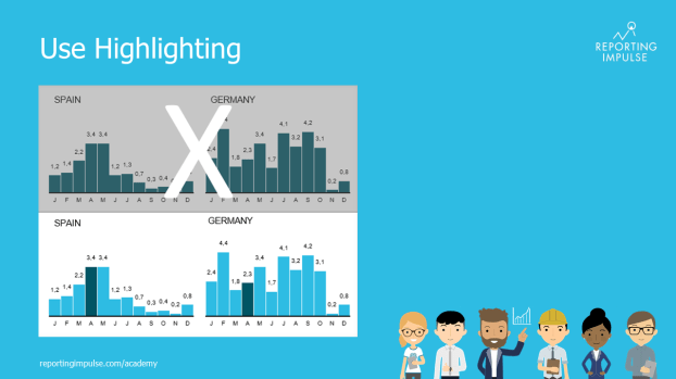
 After a chart has been reduced (see rule no.2), highlighting can now be used consciously. It guides the reader and shows which information is particularly important. A color or shape that differs from the rest automatically attracts the reader’s attention. A standardized highlighting color should be used for all dashboarding. There are many possible applications – for example, the current value can be marked during developments and columns or only individual values can be highlighted in tables. Highlights are also useful for commenting. If there is a high information density, even an entire diagram can be colored or framed.
This rule and others are explained in detail in the reportingimpulse Academy. Get Insights in our Visual Data Analytics Beginner’s Package here. In addition to our most important rules for dashboarding, it includes learning videos on the corresponding topic, book recommendations, reportingimpulse SharePics and much more.


