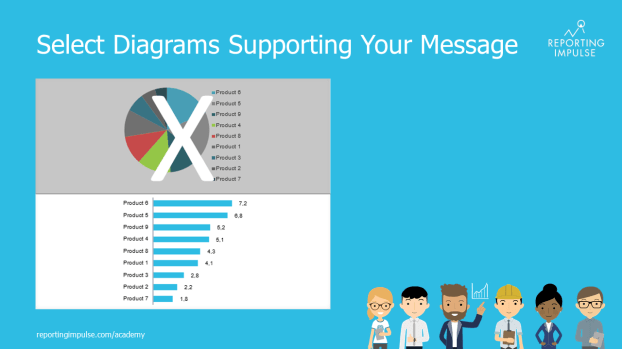

Why do we create diagrams? To deliver a specific message. This goal is achieved even better if you choose a diagram that supports the information. For example, the pie chart is the best way to display parts of a whole. We recommend that you display only two elements and distinguish them in color. Although bar charts and column charts are similar, their application is different: the former can show good structures and the latter is better suited to time histories. Line graphs show trends and correlations can be represented by scatter plots, for example. And this is only the beginning to visualize information smartly.
This rule and others are explained in detail in the reportingimpulse Academy. Get Insights in our Visual Data Analytics Beginner’s Package here! In addition to our most important rules for dashboarding, it includes learning videos on the corresponding topic, book recommendations, reportingimpulse SharePics and much more.
