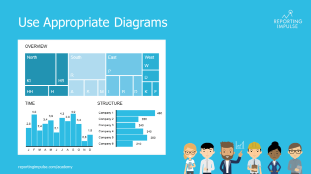
 When it comes to the interactive use of diagrams for dashboards, many people stick to the classic diagrams. But the majority are unaware that there are alternatives that are particularly suitable for interactive environments. The treemap, for example, offers a good overview of the entire company and is always well received. Or how about the bullet graph? It integrates the popular traffic light logic but is made more complex and informative by adding a current value and a reference value. There are other good alternatives! Take a look at what the tool has to offer.
This rule and others are explained in detail in the reportingimpulse Academy. Get Insights in our Visual Data Analytics Beginner’s Package here! In addition to our most important rules for dashboarding, it includes learning videos on the corresponding topic, book recommendations, reportingimpulse SharePics and much more.

The poster with all Information Design and Dashboarding rules:
