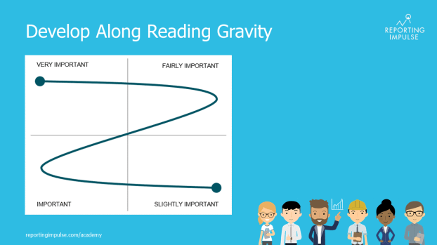
 To give structure to the dashboard and to ensure that the reader reads the most important information, attention should be paid to the reading direction (It may vary depending on the culture). There are different approaches – Gutenberg Diagram, Z-shape/ zick-zack-line or F-shape by Nielsen – they all have in common that the most important information should be in the top left corner. We recommend covering all four areas with a Z-shape. This will guide the reader through the dashboard.
This rule and others are explained in detail in the reportingimpulse Academy. Get Insights in our Visual Data Analytics Beginner’s Package here! In addition to our most important rules for dashboarding, it includes learning videos on the corresponding topic, book recommendations, reportingimpulse SharePics and much more.

The poster with all Information Design and Dashboarding rules:
