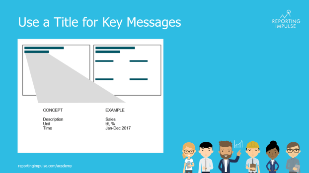
 This rule is derived from Dashboard Rule No.3, which states that the most important information should be at the top left of the page, because that is where we begin to read (attention: depending on the culture). The most important information can be found in the title concept. So, we know where the title concept belongs, but what and how much should it contain? We recommend a maximum of 4 lines – everything that interests the user can be covered in this way. The first line contains the description, the next one the unit and finally the time (span). Optionally there can be a timestamp in the fourth line. In this way, the contents of the dashboard are more easily readable, and the most important information is summarized centrally.
This rule and others are explained in detail in the reportingimpulse Academy. Get Insights in our Visual Data Analytics Beginner’s Package here! In addition to our most important rules for dashboarding, it includes learning videos on the corresponding topic, book recommendations, reportingimpulse SharePics and much more.

The poster with all Information Design and Dashboarding rules:
