
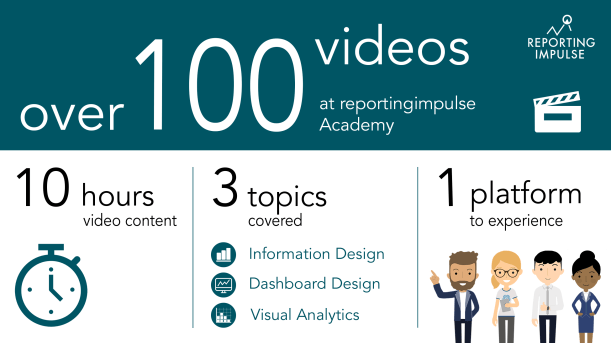
Our Visual Data Analytics Beginner’s Package is now available in english!
You would like to get closer to your goal of a data-driven company and learn more about the disciplines Information Design, Visual Business Intelligence and Visual Analytics?
If so, our Visual Data Analytics Beginner’s Package is just the right thing for you to start with! Download it here.
Are you interested, but can’t really imagine what exactly to expect? Then have a look at this video and get an insight into our Visual Data Analytics Beginner’s Package!
Click here for more information about the reportingimpulse Academy!

 A clear recommendation and also often used are visual tables. Therefor standardized tables are enriched by graphics. Micro charts are for example used before the description and the choice of the chart type depends on whether you want to see proportions, developments or trends. Within the data, the representation of absolute and/or percentage deviations is very popular. These can also be visually distinguished by thick and thin bars. In this way, outliers can be identified at one glance instead of first having to compare numbers.

 After a chart has been reduced (see
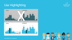
 Do you know the change blindness effect? According to it, we cannot remember all the information in similar consecutive images and do not perceive major changes. This impairs the comparability of charts. But if you increase the density of information on one page, you can compare several charts at once and provide even more information about the data by e.g. implementing microcharts and highlights. And don’t worry – if tourists can manage it with a subway map, your colleagues won’t have any problems with the high information density.
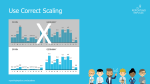
 Scaling is a very important aspect when visualizing data. If you don’t take this into account, you run the risk of distorting the data and leaving a false visual impression on the viewers. As a rule of thump, the axes should always start with 0. Charts that are related should be scaled uniformly and displayed on one page. This provides the best comparability.
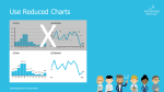
 Our goal is that everyone can read all information from our charts quickly and easily. Unfortunately, this is often prevented by cluttered visualizations. Choose a chart and think about what you do not necessarily need without any loss of information. Are coloured backgrounds and different colours, 3D effects, legends, frames and guide lines really necessary? Visualize leanly and reduce the complexity of graphics step by step.
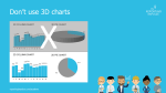
 3D charts are regularly used in companies, but they offer no added value. On the contrary – they distort the data and appear unreliable. According to a joint study with the Fraunhofer Institute, information from a 3D chart is perceived up to seven(!) times worse. So the next time you want to embellish dry data with 3D effects, remember that you don’t decorate your mails to the boss with Word Art either. 😉