
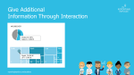
 The integration of interactive activities into the dashboard offers many advantages. For example, a navigation bar helps you keep track of what’s going on as you drill down into deeper levels. It also serves as an intuitive control where you can skip any level. In addition, it helps to create and structure the dashboard, because every page needs a name and every path has to be defined. We recommend simplifying navigation and interaction as much as possible – three filters and three lines in the title concept are usually enough. Even within diagrams, interaction in the form of (combined) highlighting, mouse over or drill in functions provides a higher added value.
This rule and others are explained in detail in the reportingimpulse Academy. Get Insights in our Visual Data Analytics Beginner’s Package here! In addition to our most important rules for dashboarding, it includes learning videos on the corresponding topic, book recommendations, reportingimpulse SharePics and much more.

The poster with all Information Design and Dashboarding rules:

 Die Integration von interaktiven Aktivitäten in das Dashboard bietet viele Vorteile. So hilft eine Navigationsleiste den Überblick zu behalten, wenn man sich in tiefere Ebenen reindrillt. Zudem dient sie auch als eine intuitive Steuerung, in der man beliebig Ebenen überspringen kann. Viel mehr hilft sie noch bei der Erstellung und Strukturierung des Dashboards, weil jede Seite einen Namen braucht und jeder Pfad definiert werden muss. Wir empfehlen die Navigation und Interaktion größtmöglich zu vereinfachen – es reichen meist drei Filter und drei Zeilen im Titelkonzept. Auch innerhalb von Diagrammen liefert Interaktion in Form von (kombiniertem) Highlighting, Mouse over oder Drill in Funktionen einen höheren Mehrwert.
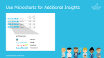
 As we already know, it is very advantageous to rely on information density. Micro charts are another instrument for this. The small diagrams are placed in a table or in a KPI tile and provide visual support for the information shown. The chart is chosen depending on the message to be conveyed (see
 Wie wir mittlerweile wissen, ist es sehr vorteilhaft auf Informationsdichte zu setzen. Ein weiteres Instrument dafür sind Microcharts. Die kleinen Diagramme werden in eine Tabelle oder in eine KPI-Kachel platziert und bieten eine visuelle Unterstützung zu den gezeigten Informationen. Die Wahl des Diagramms ist abhängig von der Botschaft, die vermittelt werden soll (siehe

 To give structure to the dashboard and to ensure that the reader reads the most important information, attention should be paid to the reading direction (It may vary depending on the culture). There are different approaches – Gutenberg Diagram, Z-shape/ zick-zack-line or F-shape by Nielsen – they all have in common that the most important information should be in the top left corner. We recommend covering all four areas with a Z-shape. This will guide the reader through the dashboard.
 Um dem Dashboard Struktur zu verleihen und zu gewährleisten, dass der Leser die wichtigsten Informationen auch liest, sollte man die Leserichtung beachten (Achtung: kann sich abhängig vom Kulturkreis unterscheiden). Auch hier gibt es verschiedene Ansätze – Gutenberg Diagramm, Z-Form/ Zick-Zack-Linie oder F-Form von Nielsen – sie alle haben gemeinsam, dass oben links die wichtigsten Informationen stehen sollten. Wir empfehlen alle vier Bereiche abzudecken mit einer Z-Form. So wird der Leser durch das Dashboard geleitet.

 When it comes to the interactive use of diagrams for dashboards, many people stick to the classic diagrams. But the majority are unaware that there are alternatives that are particularly suitable for interactive environments. The treemap, for example, offers a good overview of the entire company and is always well received. Or how about the bullet graph? It integrates the popular traffic light logic but is made more complex and informative by adding a current value and a reference value. There are other good alternatives! Take a look at what the tool has to offer.
 Bei der interaktiven Nutzung von Diagrammen für Dashboards halten sich viele an die klassischen Diagramme. Dabei wissen die meisten nicht, dass es auch Alternativen gibt, die sich besonders gut im interaktiven Rahmen anbieten. Die Treemap z.B. bietet einen guten Überblick über das gesamte Unternehmen und kommt immer gut an. Oder wie wäre es mit dem Bullet Graphen? Er integriert die beliebte Ampellogik, ist aber durch einen aktuellen Wert und einen Referenzwert komplexer und aufschlussreicher gestaltet. Es gibt noch weitere gute Alternativen, schauen Sie sich ruhig an was das Tool bietet.
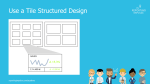
 Microsoft, Sony, Netflix and others all use the modern and intuitive tile structure. It is easily adaptable to different device sizes, from desktops to smartphones. Just as you want to have a preview of the Netflix series, it is also useful to have an overview of a data set. Tiles can have different layouts in dashboards. The simplest version is a link to the report – but the more information there is on the tile, the greater the added value.