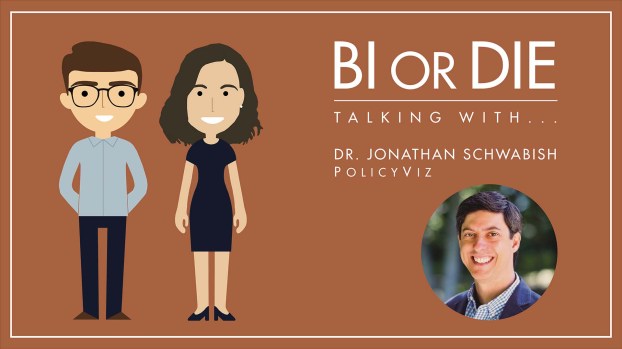
Jon, Viktoria and Kai talk about Data Viz and its importance, opportunities and feasibility in practice.
Dr. Jonathan Schwabish is founder of the data visualization and presentation skillsfirm, PolicyViz and a Senior Fellow at the Urban Institute, a nonprofit research institution in Washington, DC. There, he is a researcher in the Income and Benefits Policy Center and a member of the Institute’s Communication team where he specializes in data visualization and presentation design. His research agenda includes such areas as earnings and income inequality, immigration, disability insurance, retirement security, data measurement, the Supplemental Nutrition Assistance Program (SNAP), and other aspects of public policy. Jonathan is also considered a leader in the data visualization field and is a leading voice for clarity and accessibility in research. He has written on various aspects of how to best visualize data including technical aspects of creation, design best practices, and how to communicate social science research in more accessible ways. In both positions, Jonathan helps nonprofits, research institutions, and governments at all levels improve how they communicate their work and findings to their partners, constituents and citizens. He also teaches data visualization and presentation skills at Georgetown University, American University, the University at Buffalo, and in public workshops. He also hosts the PolicyViz Podcast, which focuses on data, open data, and data visualization. His book Better Presentations: A Guide for Scholars, Researchers, and Wonks helps people improve the way they prepare, design, and deliver data-rich content and his edited book, Elevated the Debate: A Multilayered Approach to Communicating Your Research, helps people develop a strategic plan to communicating their work across multiple platforms and channels. His latest book, Better Data Visualizations: A Guide for Scholars, Researchers, and Wonks details essential strategies to create more effective data visualizations.
In today’s episode you will learn:
- Why the topic of DataViz is and remains so exciting
- Insights from Jon’s new book „Better Data Visualizations: A Guide for Scholars, Researchers, and Wonks“.
- Is there one best visualization or one that always works?
- Is there a favorite tool for a DataViz expert?
- More recommendations on other formats and colleagues in the DataViz environment.
You can listen to and subscribe to the podcast here:
Apple Podcast | Spotify | Google Podcast | Deezer
Follow us on Instagram & Twitter:
reportingimpulse | dashboardheroes | BI_or_DIE | team_reporting
Mentioned in this episode:
- Dr. Jonathan Schwabish
- Recommendations
- Book | Storytelling with data – Cole Nussbaumer Knaflic
- Book | The Functional Art: An introduction to information graphics and visualization – Alberto Cairo
- Book | How Charts Lie – Alberto Cairo
- Cédric Scherer
- Makeover Monday
- Tidy Tuesday
- Data Visualization Society
Get in contact on LinkedIn:
You liked this episode? Then please give us a quick iTunes-review!
Which questions should we ask next? Which interview partners would you like to hear? Please write us an email info@reportingimpulse.com, via Twitter or get in direct contact with us!
