Von Dashboarding und Designumsetzung über Datenanforderungsframework und Semantik bis hin zu strukturellem Datendesign zwischen Data-Warehouse und BI-Tool – Carsten und Kai sprechen darüber, wie cloudimpulse die strategische Begleitung von BI-Umsetzungsprojekten gestaltet.
Was genau macht cloudimpulse eigentlich? Und was hat reportingimpulse damit zu tun? In dieser Folge erfahrt ihr die Motivation hinter der Gründung von cloudimpulse, den aktuellen Tech-Stack und welche Themen und Schwerpunkte euch in der Serie erwarten werden.
Hat euch die Folge gefallen? Dann gebt uns gern eine kurzeiTunes-Bewertung!
Welche Fragen sollen wir demnächst stellen? Welche Interviewpartner möchtet ihr gerne hören? Schreibt uns gern eine E-Mail aninfo@reportingimpulse.com, überTwitteroder sprecht uns einfach direkt an!
Jon, Viktoria and Kai talk about Data Viz and its importance, opportunities and feasibility in practice.
Dr. Jonathan Schwabish is founder of the data visualization and presentation skillsfirm, PolicyViz and a Senior Fellow at the Urban Institute, a nonprofit research institution in Washington, DC. There, he is a researcher in the Income and Benefits Policy Center and a member of the Institute’s Communication team where he specializes in data visualization and presentation design. His research agenda includes such areas as earnings and income inequality, immigration, disability insurance, retirement security, data measurement, the Supplemental Nutrition Assistance Program (SNAP), and other aspects of public policy. Jonathan is also considered a leader in the data visualization field and is a leading voice for clarity and accessibility in research. He has written on various aspects of how to best visualize data including technical aspects of creation, design best practices, and how to communicate social science research in more accessible ways. In both positions, Jonathan helps nonprofits, research institutions, and governments at all levels improve how they communicate their work and findings to their partners, constituents and citizens. He also teaches data visualization and presentation skills at Georgetown University, American University, the University at Buffalo, and in public workshops. He also hosts the PolicyViz Podcast, which focuses on data, open data, and data visualization. His book Better Presentations: A Guide for Scholars, Researchers, and Wonks helps people improve the way they prepare, design, and deliver data-rich content and his edited book, Elevated the Debate: A Multilayered Approach to Communicating Your Research, helps people develop a strategic plan to communicating their work across multiple platforms and channels. His latest book, Better Data Visualizations: A Guide for Scholars, Researchers, and Wonks details essential strategies to create more effective data visualizations.
In today’s episode you will learn:
Why the topic of DataViz is and remains so exciting
Insights from Jon’s new book „Better Data Visualizations: A Guide for Scholars, Researchers, and Wonks“.
Is there one best visualization or one that always works?
Is there a favorite tool for a DataViz expert?
More recommendations on other formats and colleagues in the DataViz environment.
You liked this episode? Then please give us a quickiTunes-review!
Which questions should we ask next? Which interview partners would you like to hear? Please write us an email info@reportingimpulse.com, viaTwitteror get in direct contact with us!
AndreasundKaisprechen über Seminargestaltung, die Notwendigkeit einer DataViz Guideline und die Vorteile des Streamings.
Die Themen in dieser Folge:
🎬 Streaming – Potenzial und Vorteile 📊 Dashboards sind keine Taschenmesser – warum? 🎓 Seminargestaltung und -aufbau 💡 Warum brauchen wir eine DataViz Guideline? 👶 Schlafen die Kinder schon?
Und noch etwas in „eigener“ Sache – eine Herzensangelegenheit
Ihre Vision ist es, beste Bildung für Kinder und Jugendliche zu fördern. Dafür steht das Engagement der Stiftung Bildung. Sie stärkt Partizipation und Vielfalt in der Bildung, handelt unabhängig und in eigener Verantwortung. Die Stiftung Bildung wirkt über das bundesweite Netzwerk der Fördervereine an Kita und Schule direkt an der Basis, stärkt die Handelnden und lässt Ideen vor Ort Wirklichkeit werden. Kita und Schule gestalten das vielfältige Bildungssystem aktiv selbst, orientiert an den jeweiligen Kindern und Jugendlichen ihres Standortes und verändern damit Gesellschaft.
+ + NEU + + + Unser BI or DIE Magazin – Alle News regelmäßig im Überblick!
Hat euch die Folge gefallen? Dann gebt uns gern eine kurzeiTunes-Bewertung!
Welche Fragen sollen wir demnächst stellen? Welche Interviewpartner möchtet ihr gerne hören? Schreibt uns gern eine E-Mail aninfo@reportingimpulse.com, überTwitter oder sprecht uns einfach direkt an!
Andy,ViktoriaandKaion using the DataViz Design Process in everyday business practice.
Andy Kirkis an experienced UK-based data visualisation design consultant, trainer, lecturer, author, speaker, and researcher. He is the editor of visualisingdata.com and host of the ‘Explore Explain’ video and podcast series. Since foundingVisualising Data Ltd. in 2010, Andy has worked with a wide range of clients, including Apple, S&P Global, Arsenal FC, Google, EU Council, and Pfizer. He has conducted over 300 public and private training courses in 27 different countries. Andy has previously delivered post-graduate teaching with MICA (USA) and Imperial College (UK), and is now an adjunct lecturer at UCL (UK), teaching a module on the MSc Business Analytics programme. He has authored three books, with the most recent published by Sage in August 2019 and titled ‘Visualising Data: A Handbook for Data Driven Design (2nd edition)’.
Here’s what you can take away from the podcast today:
📈 You understand the DataViz Design Process and how to use it
🧐 Projects and companies that have made a lasting impression on Andy
🚀 How each of you, regardless of hierarchy level, can successfully launch a DataViz initiative
⚒️ Why do we need to talk about tools in addition to method?
💪🏼 What makes a good virtual training?
📊 Where can we get inspiration for new DataViz projects?
You liked this episode? Then please give us a quickiTunes-review!
Which questions should we ask next? Which interview partners would you like to hear? Please write us an email info@reportingimpulse.com, viaTwitteror get in direct contact with us!
Nick, Viktoria & Kai talk about different dashboard types and how a tool-independent taxonomy leads to better and more comprehensive dashboards.
As an independent educator and consultant, Nick Desbarats [pronounced DEH-burr-ah] has taught data visualization and information dashboard design to thousands of professionals in over a dozen countries at organizations such as NASA, Bloomberg, The Central Bank of Tanzania, Visa, The United Nations, The University of Toronto, and Shopify, among many others. Nick was the first and only educator to be authorized by Stephen Few to deliver his foundational data visualization and dashboard design workshops, which he taught from 2014 until launching his own workshops in 2019. His books „Practical Charts“ and „Practical Dashboards“ will be published in 2021.
In today’s episode you will learn:
💡 What is a common definition of a dashboard? 🚦 What types of dashboards are useful for organizations? 🌀 Why we should think more in terms of dashboard ecosytems? ⚡️ What the dashboard taxonomy is all about? 📚 How companies and everyone can approach the topic?
You liked this episode? Then please give us a quickiTunes-review!
Which questions should we ask next? Which interview partners would you like to hear? Please write us an email info@reportingimpulse.com, via Twitteror get in direct contact with us!
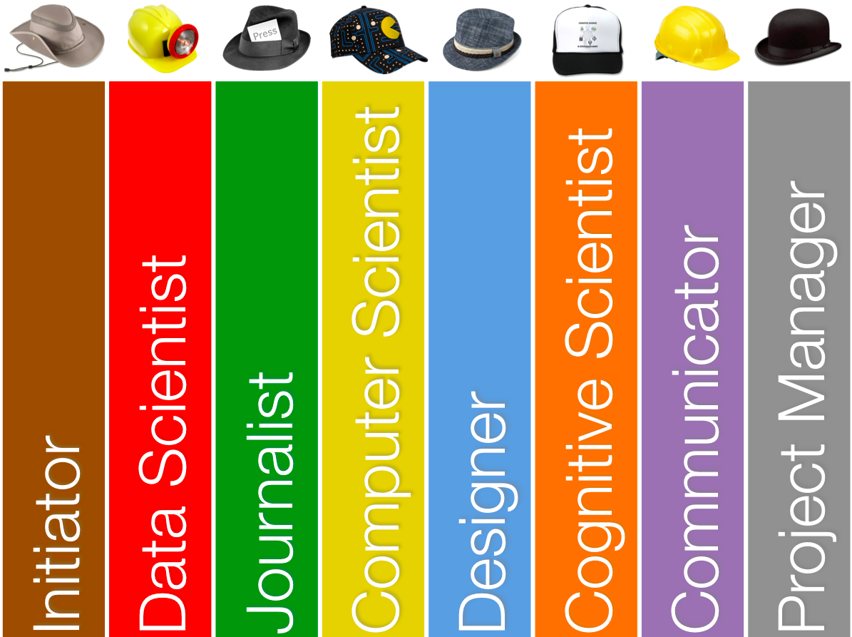
Andy Kirk schreibt in seinem Blog von den „8 hats of data visualisation design“ und visualisiert sein Konzept entsprechend:
Quelle: Andy Kirk
Ein interessanter Ansatz, um ihn einmal zu durchdenken.
Der Initiator sucht eine Lösung für ein bestimmtes Problem und gibt die Rahmenbedingungen vor
Der Data Scientist stellt die Daten bereit
Der Journalist ist der Storyteller im Team
Der Computer Scientist ist der Umsetzer im Tool
Der Designer kümmert sich um die Harmony zwischen Form und Function
Der Cognitive Scientist ist für die konzeptionelle Umsetzung verantwortlich
Der Communicator ist Vermittler und Präsentator der Idee und Umsetzung
der Project Manager hält das Projekt zusammen
Nun wird ja nicht jedes Design Projekt mit acht Personen und den entsprechenden Positionen besetzt. Das ist ganz normal und sollte nicht zu Problemen führen. Natürlich darf eine Person auch mehrere Positionen einnehmen.
Die Idee von Andy Kirk ist insofern aber sehr interessant, da man alle diese Positionen innerhalb eines Projektes beachten sollte und sich öfter fragen sollte, was die Person in der jeweiligen Position wohl tun würde.